Neutrals and the past….
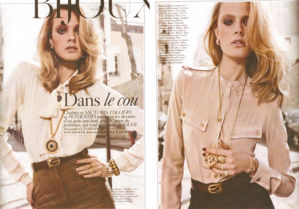
The whole look and feel of this resonates with the season. I really love the rose pink, and I don’t care what anyone says, pink can definitely be incorporated into the neutrals category! Let me clarify; ROSE PINK IS A NEUTRAL TONE! I say this because this subtle color seems almost as if it’s on it’s way to brown. It looks amazing with gold accessories…delicate rose gold. See? Even the metals have a hint on warmth to it. There’s something absolutely sleek about neutral tones. Honestly I don’t suggest them for a younger target market though, not unless it’s combined with a bold color. As you can see, the model is young, but these colors kind of age her. The photo shoot looks 70’s-ish, it’s obviously the theme, but regardless the model looks way older than she is. Damn…I’m a bad-ass when it comes to fashion. Just wait till you see MY photo shoots. I will definitely be using neutral tones.


Leave a Reply
You must be logged in to post a comment.